
Guide to folder finishing
The finish you choose is what turns a printed folder from functional to memorable.
It's the first thing a client touches when you hand it over, and it sets the tone for everything inside. This guide walks through the five most common finishing techniques used on presentation folders — what each one does, how it looks and feels, when to use it, and what it adds to the cost.
Lamination
Lamination is a thin plastic film bonded to the printed surface of the folder under heat and pressure. It's the most common finish we apply, and for most folders it's the baseline rather than an upgrade — it protects the print from scuffs, fingerprints and moisture, and noticeably extends the life of the folder.
You have three main options:
Gloss lamination — A bright, reflective finish that makes colours pop. Best for vibrant, photo-led designs where you want maximum impact.
Matt lamination — A softer, more understated look. Colours read as slightly muted but more sophisticated. The standard choice for professional services, legal and corporate work.
Soft-touch lamination — A matt film with a velvety, almost suede-like feel. The most premium of the three and the one clients tend to comment on.
Lamination pairs well with every other finish on this page — in fact, spot UV and foiling are often applied over lamination for extra contrast.
The most cost-effective way to upgrade a folder. Soft-touch carries a small premium over standard matt or gloss. All three significantly improve durability.
Foiling
Foiling — sometimes called foil blocking or hot foil stamping — applies a thin metallic film to specific areas of the folder using a heated die. Unlike printed metallic inks, real foil has genuine reflectivity and a slight tactile depth where the die has pressed into the board.
It's typically used on logos, headlines or small decorative elements rather than large fills. Available colours include gold, silver, rose gold, copper, and a range of pigment foils including white and black, plus holographic options.
The go-to finish when you want a folder to feel premium the moment it's picked up. Works particularly well on matt-laminated black, navy or deep colours, where the contrast with the metallic is strongest. Common uses include legal firms, luxury brands, wedding stationery suppliers, and anniversary or limited-edition print runs.
Adds a tooling cost (the die has to be made) plus a per-unit cost, so it's most economical at higher quantities. The foil itself is durable and won't fade, though it can scratch if abused.
Spot UV
Spot UV is a clear, glossy varnish applied to specific areas of a printed folder and cured under ultraviolet light. The effect is subtle: from straight on, the varnish is nearly invisible, but at an angle it catches the light and reveals a high-gloss pattern over the matt surface beneath.
It's almost always applied over matt or soft-touch lamination — that's where the contrast comes from. Apply it over gloss lamination and you'll lose most of the effect.
Beautiful for picking out logos, patterns or background motifs without committing to the cost of foiling. Also useful when you want a subtle, design-led finish that rewards a closer look — clients tend to notice it when they tilt the folder, which makes for a small "moment" in the unboxing.
More affordable than foiling for similar visual impact. Requires a separate plate and a second pass, so it's not free, but the per-unit cost is modest. Highly durable once cured.
Embossing & Debossing
Embossing and debossing are tactile finishes that physically reshape the surface of the folder, no ink involved.
Embossing — Raises an area of the board up from the surface using a metal die.
Debossing — Presses an area down into the board.
Both create a strong tactile impression that you can feel as much as see. Because there's no ink or foil, the effect is monochrome and shape-driven, which makes it ideal for logos, monograms and minimalist branding. You can also combine these with foil (a "foil emboss") for a finish that's both raised and metallic.
The most understated of the premium finishes. Suits brands whose identity is built on restraint — architects, high-end consultants, fashion houses — and pairs beautifully with uncoated or soft-touch stocks. Debossing is currently more popular than embossing for logos, partly because it's less likely to flatten in transit.
Like foiling, there's a one-off cost for the die. The per-unit cost is similar to spot UV. Both finishes are extremely durable — there's nothing on the surface to scratch off.
Die-cutting
Die-cutting is the process that gives a folder its physical shape. Every folder we produce is die-cut to some extent — the pockets, the spine and the business card slots are all cut using a custom-shaped blade called a die.
Beyond the structural cuts, die-cutting can also be used decoratively:
Window cuts — Reveal a printed insert or a contrasting inner panel.
Shaped edges — Replace standard right-angle corners with curves or custom outlines.
Custom pocket shapes — For non-standard inserts.
Thumb cuts — Make documents easier to remove from the pocket.
Worth considering when your folder needs to do something a standard template can't — house an unusual insert, reveal a piece of artwork, or simply look distinctive on a desk full of generic A4 folders. For most clients, the standard die already covers what's needed.
A custom die has a one-off setup cost, after which the per-unit cost is no different from standard cutting. If you're ordering in volume, it's often more affordable than people expect.
Frequently asked questions
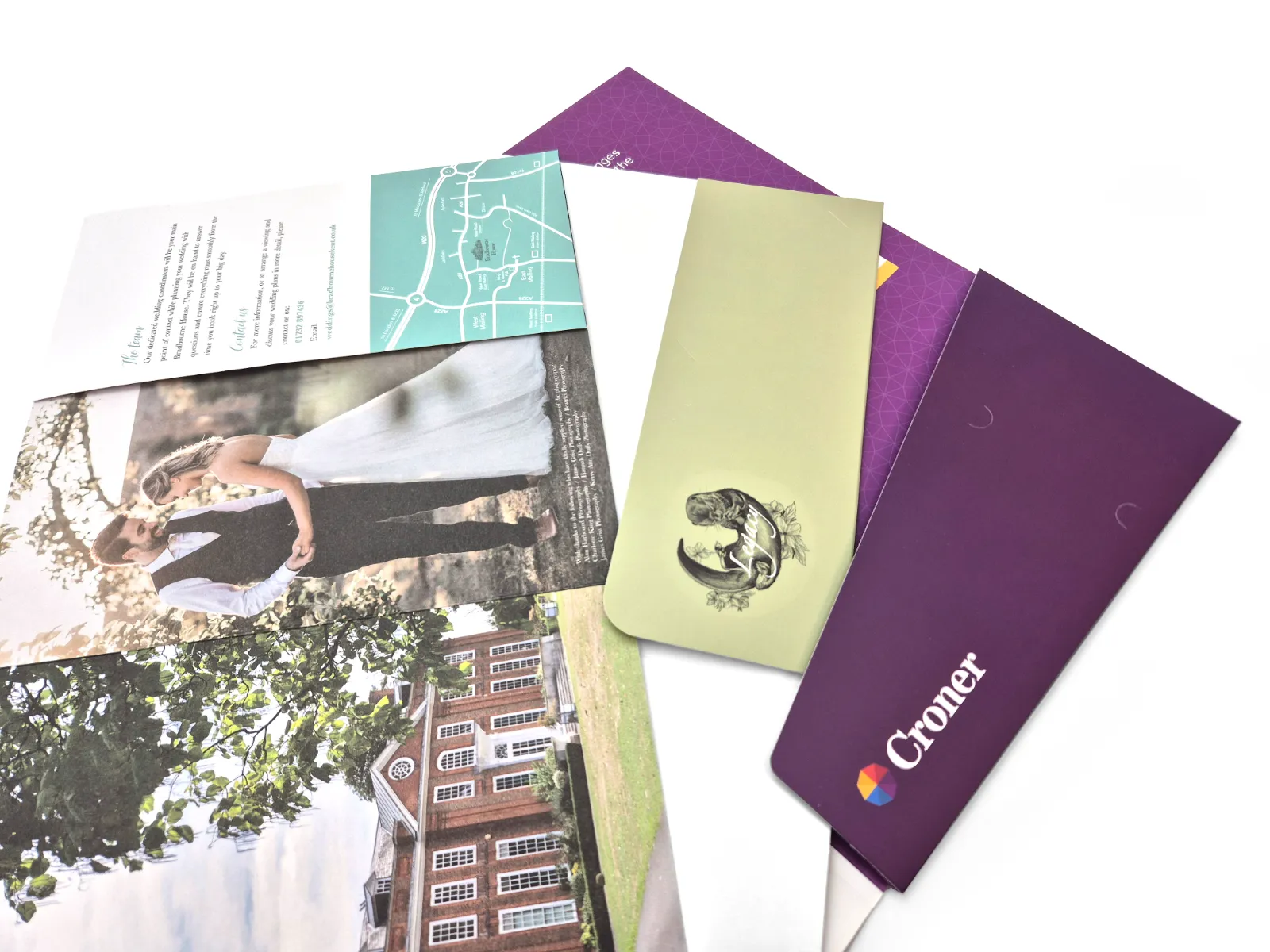
Feel the difference
in person
We send free sample packs anywhere in the UK so you can compare matt against soft-touch, see how foil reads against spot UV, and decide what fits your brand.